

The Emmy-nominated creators of The White Lotus main titles talk about the research, collaboration, and Thai art used to introduce the series.
The first rule of The White Lotus is you do not skip The White Lotus main titles.
Created by 4-time Emmy nominees Katrina Crawford and Mark Bashore in partnership with 3D artists Mauro Gimferrer Alos and Marcos Coral, The White Lotus main titles for its third Thailand-set season reflect the season’s shift in theme and tone. According to Crawford and Bashore, they felt writer-director Mike White’s scripts emerged with a much darker tone. More sinister. More brooding. Their main titles needed to reflect not only that shift but also the Thailand locale.
To reflect that shift in tone and locale, Crawford and Bashore implemented several subtle techniques.
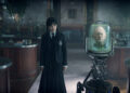
“You do see a lot of that in a couple ways. There are lots of leering eyes and lurking animals. There’s a sense of being hunted, and it’s sort of ambiguous who’s hunting and who’s the hunted,” Crawford explained. “We liked that feeling, a sense of unseen danger that someone’s not aware that there’s danger lurking right there. That pending doom. That sense of unease that we want to bring into the show. There’s larger forces at work, and that’s true to all of [White’s] work.”
Crawford and Bashore also reflect the duality that White includes within each season. A duality of paradise and hell, of beauty and danger. That duality coupled with the darker tone of the Thailand-set season also inspired the team to pursue a 3D visual scheme. That allowed shadows to pass over character’s faces or a sailboat to suddenly pass over elements of the design.
They employ 3D for a few reasons. One, it reflects the penchant of the series to allow walls to tell stories. Often throughout the series, wall design elements reflect the themes of the series. The Thailand-inspired main titles followed suit with an ever-shifting visual palate that effectively unsettles the viewer. Second, the 3D reflects the complexity of the themes and character interactions. Crawford and Bashore want to provide an introduction that not only orients the viewer within this particular White Lotus world but also provides a variety of engaging visual motifs that audiences hopefully explore each week.
It often creates an effect that causes insecurity within the viewer as to what they’re actually seeing.
“Katrina developed this idea that what if you couldn’t quite trust the artwork, which is a good theme for the show. Can you bet on this artwork that you’re looking at? It’s doing weird things, and the last time I checked, still paintings don’t cast shadows on themselves,” Bashore provided. “We’re after a mood or a feeling or a tone more than design in a traditional sense.”
Audiences relishing The White Lotus main titles often examine them looking for clues. Which icons represent characters within the series? Do the main titles provide clues to the central mystery? Do we even find out who dies early in the episode?
While it’s not their primary motive (that’s a reflection of the season’s theme), Crawford and Bashore definitely reference some characters within their design. You may not specifically recognize them, but the references are there.
“We’ll probably have maybe 20 or 30 different ideas per person per character, and then we have to decide what best represents them or what works in the sequence,” Crawford said. “It’s not just this person smokes cigarettes or something. It’s much more about their character or something about their flaws, something that’s maybe a little bit mischievous. It tends to be as complex as we can get away with, which is the goal, right? For us, the titles are sort of a portal, so what’s important for this is tone: that feeling of unease and the darkness mixed with mischief.“
The White Lotus streams exclusively on HBO MAX.


