

One of my favorite things about the production design of Apple TV+’s The Studio is that everything feels like it carries so much weight and history. It is easy for viewers to assume that they just rented out the offices of an existing working studio and revamped it, because it feels very present. We feel like we are having the curtain pulled back to witness the creation of our new favorite blockbuster or art house darling. Production designer Julie Berghoff relied on her love and appreciation of Frank Lloyd Wright architecture to create a wondrous world of moviemaking.
Right before I jumped on the line with Berghoff, I remembered her work on TNT’s underappreciated drama I Am the Night that took place in 1965 Los Angeles. Perhaps some the characters from that series are familiar with Continental Studios’ history.
“I have a love of architecture, and I had a lot of right around me,” Berghoff says. “Wright studied with [Louis] Sullivan, so I used to walk in Chicago in and out of buildings to avoid the cold.”
Think of all the logos from your favorite film studios and how they evolved. I still remember the version of the Universal Pictures logo I grew up with and how cool it was to see the letters floating over the planet when it changed time and time again. The Continental Studios logo had to have that legacy as well, and I would love to see Apple release a coffee table book of all the different iterations. Creating a singular logo is harder than you think.
“I worked with this incredibly talented graphic designer named Zach Fannin who actually designed the second Avatar logo, and we struggled with that,” she admits. “We wanted it to be over 100 years old, and it needed to be classic like from the Golden Age era. We designed probably over 100 logos. So many of them were so cool, but Seth [Rogen] and Evan [Goldberg] gravitated towards the more ’60s era, like around the end of Saul Bass inspired logos. I really needed to design an art deco logo like from twenty years ago, but we felt that wasn’t the right look. We wanted it to be the sun, and we went through all the elements, Greek gods, and animals. I was scouting the Kelly Lynch house, and it has the iconic John Lautner doors with the handles in the shape of the [letter] C. That really inspired me, and then we kind of drew on top of that. I am a very textual designer, and I gravitate towards mud and texture. That door is cast bronze and it has so much to the touch in it, and, in the end, it was a multi-layered sun. We thought about how it needs to move as the opening vanity logo.”
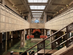
When you enter the offices of Continental, you are greeted by a gorgeous green floor, and the tiles feel like its own version of the Yellow Brick Road. The balconies that wrap around the second floor overlook the lobby, as if to check on any future clients or filmmakers ready to take a meeting. I love the skeletal columns and the pendant lighting hanging on the second floor.
“When I design something, I first almost do a ground plan with visual references,” she says. “We looked at a couple different architects before deciding on Frank Lloyd Wright, but I like to get the movement through the space. I want to identify what each space means, and I don’t like to design only for aesthetic reasons. We decided that Continental was kind of like behind-the-times, and it was holding onto its beauty. One corner is dedicated to its Oscars, another is kind of about the history of filmmaking in the lobby with a director’s chair. Originally, the fountain was two stories, and it was noisy. We didn’t have enough time to really practice it–it didn’t have a good audition. We built that set in six weeks, and the cast played first. Seth and Evan really wanted the cast together to get the cohesiveness of the actors with the crew and the camera movements. It was the perfect place to bring everything together as a team. Maybe we can have an entire episode to Matt really wanting a fountain in season two?”
Along the staircase is a stunning mural that Berghoff wanted to detail more film history. Instead of putting in performers that we know, however, she created something entirely new with the Continental Studios’ C radiating beams of light. We hold the art of filmmaking as something sacred, and this gorgeous piece of art feels truly special.
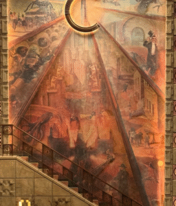
“That was another nail biter,” Berghoff says, with a laugh. “The C is very proud, and I also designed a kind of monumental artifact that took place of the water tower that’s in the back. You can’t really see it, so maybe you will in season two. Originally, we were going to do something at the gate, so I was trying to figure out a way to create our own. The C came from that, and the mural came from the sun and I tried to bring that element in. I thought it would be cool to create space for different eras of filmmaking. I started with the ’20s and I pulled from things like Alfred Hitchcock, and I just did a deep dive on screwball comedies. Each ray of the sun is a different era that I dedicated to Continental’s history. I didn’t want it to be [only] Hollywood’s history, and I wanted to make it our own. I had to figure out what our version of Buster Keaton or Bing Crosby was. I thought also about the studio starting to fail and maybe in the ’60s and ’70s they tried their hand at some monster movies or weird robot stories. I wanted to show the glory but also the deterioration.”
Since Matt Remick was the new king of the castle, he probably has some ideas of what he wants his throne room to look like. He probably made some changes to the interior decorations when Catherine O’Hara’s Patty was pushed out. The office is large with a seating area off to one side and a bar on the other. There is a lot of room to play, so what is important to Mr. Remick?
“His coffee machine,” she says plainly. “His big note was that he wants everyone to be able to do a lot of things in there, because the camera was always moving. It should be big enough that when people could be in different parts of his office and turn around and catch people doing things. We thought that the coffee bar in his office was originally a bar bar in the golden age. We had some areas where he could put some bottles below, and we just really looked into the golden era of how they had things and how it’s different than how we do things now. It’s hard to mix modern architecture, but we could mix props. Even the bulletin board that they bring in had to feel custom. Matt Remick loves loves loves vintage, and it’s like he gets to live in it.”
The Studio is streaming now on Apple TV+. Do yourself a favor and follow Berghoff on Instagram. Her behind-the-scenes looks are fantastic.


